
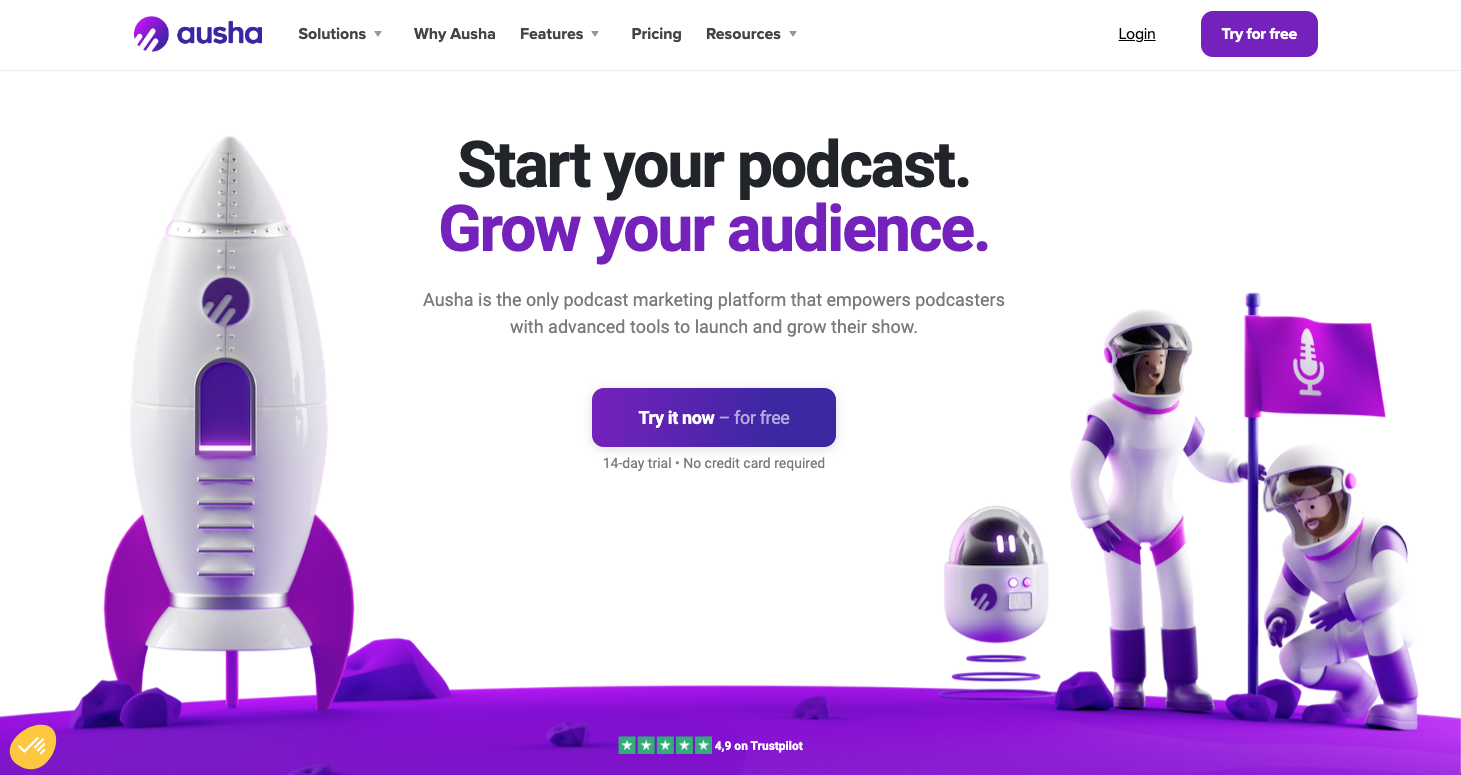
Since our creation, we have represented our all-in-one platform as a powerful rocket in which podcasters get on board, symbolized by cosmonauts. They are then boosted by all the platform’s features that help them get their podcasts off the ground and touch the stars. 🚀
To give life to this space theme, we have boosted our visual identity with new colors, new gradients and more sophisticated illustrations.
It looks like this 👇
A refreshed logo
We’ve changed our colors to new, more modern and luminous shades of purple to refresh the logo. 💜
The bubble lights up with lighter and more energizing colors. And if this change seems slight, it nevertheless drastically modernizes the image of Ausha.
Brighter and more technological colors
Purple has been a central element of our visual identity since the creation of the brand. So we chose to keep it and make it evolve into a more electric, modern and bright purple. 💜
Finally, this main color palette is accompanied by a more pop secondary color palette that further refreshes the brand: yellow and orange, fushia pink and midnight purple. 🤩

More color gradients
We’re very attached to our purple gradient, which is not only the most representative element of Ausha since its creation in 2018, but which also symbolizes the darkness of space and its infinite possibilities. ✨
It’s therefore only natural that we’ve made it evolve thanks to our new more electric, more pop, and fundamentally more modern shade of purple.
And because darkness only reveals itself when it’s near a light source, we’ve imagined 4 new pastel shades that illuminate and soften our colors.
Clearer and fresher, these 4 new shades symbolize the different variations of the sky. They are: Sunny, Dawn, Dusk, and Night.

3Ds that bring our space universe to life
This rebranding was therefore an opportunity for us to rework all our 3D illustrations so that they reflect our new direction and our new aspirations. 😁
We wanted friendlier and more welcoming characters (like you, and like us) that represent the diversity of podcasters; a rocketship straight out of a dream world that symbolizes our all-in-one platform; and colorful objects that podcasters use daily.

Our product highlighted by sleek visuals
Finally, we were eager to further highlight our platform, which you seem to appreciate (according to your comments) not only for its services but also for its aesthetics. 🌈
So for several months we worked on creating sleek visuals that represent Ausha’s tools. 💜

Mix it all together and… Taa Daa
Last but not least: Our website has a new look for a new life! All of this rebranding work is beautifully illustrated here: https://www.ausha.co/
Beyond its visual aspect, we have also imagined a brand new architecture that will better guide future Ausha podcasters. In particular, they will be able to find details about each feature offered on the platform.
But the best thing to do is to go and see for yourself! 🤓
We know that speeches only interest those who are giving them… so we promise we’ll keep it short. 😉
This sharper, new, more professional, more modern, and more technical brand image was created thanks to all the hard work from our Marketing team and our creative agency Bruno.
(standing ovation 👏👏)
If you like the new look, tell us on social media and share our new colors with your friends!

Launch your podcast with Ausha
All-in-one platform to easily launch and grow your podcast.
Start for Free

